Landmark Poetics in Ethiopia. This is going to be a massive public art poem in Ethiopia. I have to make my mind up today on the design. Which do you think works best. I prefer black text on white background. What do you think? PLEASE let me know.
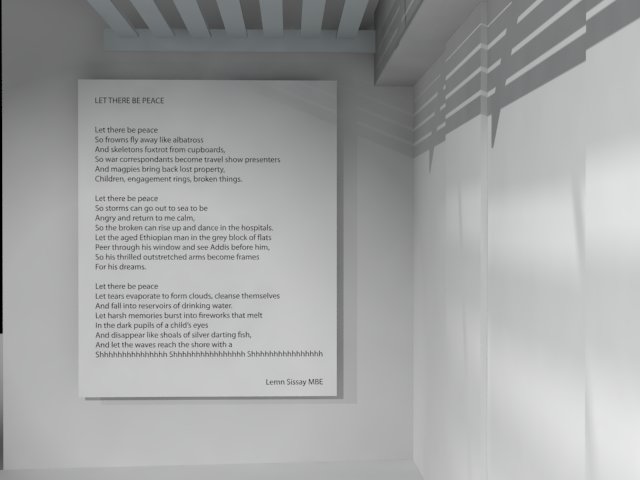
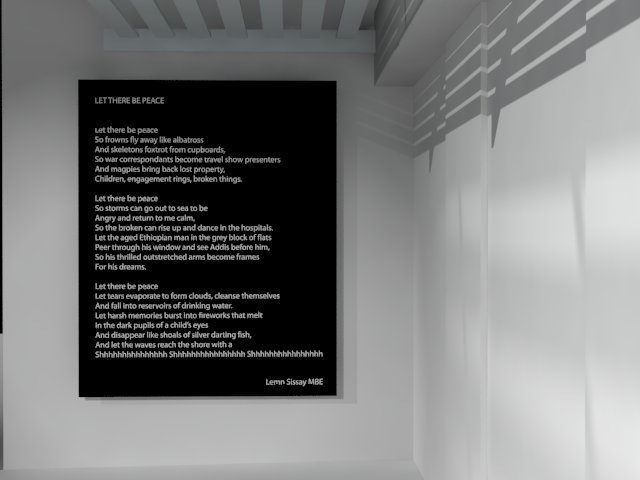
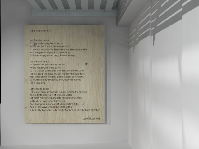
Landmark Poetics in Ethiopia. This is going to be a massive public art poem in Ethiopia. I have to make my mind up today on the design. Which do you think works best. I prefer black text on white background. What do you think? PLEASE let me know.


Lemn
I like the organic wood. It includes nature into the building material. And the building material can bring us back to nature.
Lynn
Thanks Lynn
me too
the third design is my favourite
I agree with you that the first (black on white) is the most profound. The text is the focus and stands out.
Good luck 🙂
Me too mary
Got to be the wooden one – it looks natural and beautiful and – peaceful.
See the problem for me with wood is readability but THANKYOU
Hi Lemn
Yes def black text on white background
I love your poem
All the best x
Thanks Carol I agreeeeeeeeeeeee weeeeeee
iM sure that Black on white is easier for people who have sight impairments, you could get technical advice from an expert maybe but I am sure white-on-black is difficult for some to read, hope that’s helpful
totally agree and this issue has come up
Hi Lemn – you never stop! It was wonderful to have you in the LitFest programme and I know you connected significantly with many people while you were there.
Congrats on this project and..
To your question – I prefer the white background and also the woodgrain one. On the latter though, there be local reasons on how that is received, which you know better than I… the black is too stark imo.
Good luck… shhhhhhhhhhh 🙂
Litfest was a total blast – thanks for this feedback
I prefer the first design, contrast wise.
I agree
I would also go for black background with white text.
Hmmmm thanks Samson
Hi how are you doing My choice is also black text with white background.
Prefer the black print on white background – no ornamentation, plain and simple yet makes an impact by being just that
I agree
Hi Lemn,
With the background of the background being white, I prefer white text on black background. I think that way, readability would be best for the whites and blacks are alternated. much respect
Thankyou!
white on black, the text ‘pops’
Black on white
Hi Lemn,
I prefer the third one. Good luck with making the decision. May I ask where the event is held?
Loved your work about the ”Battle of Adwa”. Extraordinary!
Best,
Tiobesta
Thanks Tiobesta
Definitely black on white is best.
Hey man I agree
I agree with you Lemn.
We are the ink.
it seems white on black is winning ..what ever the choice the words ring out peace and harmonyxxx
I like the contrast of the white text and black background, or as a second choice the black text in a white background
And a few agree with you Georgia
wood please xx
Cheers James
White on the black background frames the words and maybe think about the different light/brightness that it will shine on it in Ethiopia.
Ooooo thanks Gill XL
I like the white; it seems to make the text clearer, but also reminds me of those overhead projector things, so it seems bland. I also like the black, because I’m drawn to the visual depth of it, which possibly for me, means I will work harder at reading the text. I don’t like the wood/grainy one, I find it too distracting. It’s a beautiful poem, love the arms framing the dream…
If I had to choose, I’d go for the black because I think it frames your words with more clarity/depth. 🙂
You are bng on the money and I am going for this one
Definitely the black text on the white background. Its a beautiful poem so I hope many people have the chance to enjoy it!
Thanks Lizzie
Hi Lemen,
I like Black background by white
Saba
Thanks Saba
Most seem to!
the wooden platform looks beautiful, but considering the readbility of the text I would prefer black text on white background too. which centering the reader on the poem.
Thanks memar
I like the black background it really stands out. Just a legacy question how will all the options weather ?
Hi Lemn,
The white text on black is certainly striking – but is it essentially harder to read?
The wooden one detracts from the words.
It’s a poem with peace and space within the words – go for the simple black text on white!
I do like the wood grain, I love anything in wood, but I think for impact and readability it has to be the black text on white background.
Love the poem, always enjoy your stuff… 🙂
It was very cool to hear you read this at the Litfest in Dubai, what an introduction to you. Awesome.
Yeah black on white.
Black background with with text, we can identify with the blackness, which was there before the light! It will attract a lot of attention
Black background, white text